CAPE FEAR FLYERS

Team Branding Exploration
Cape Fear Identity
The Cape Fear identity was born first from a simple idea - what if a team used a Flying Squirrel with flight goggles as a mascot?
Inspired by the Wright Brothers and the advent of aviation - we chose North Carolina as our team's location, specifically landing on Cape Fear, a coastal area south of Wilmington. From there, we built the flyers brand with aviation in mind, using streamlined shapes, stripes, and bold blocky fonts that emulate the markings on naval aircraft.
Through our brand exploration, we also found further naval connection in the Battleship USS North Carolina, which is permanently moored in nearby Wilmington as a historical attraction. Using this, we leaned further into the naval theme, and chose to include an alternate uniform honoring the battleship.
Colors
Atlantic Navy (#151D33)
The primary brand color draws inspiration from Cape Fear's coastal identity, as well as the naval plane Convair F2Y Sea Dart's iconic blue livery.
Electric Gold (#DFBE47)
Electric Gold injects energy into the palette, creating high contrast with the darker navy color and symbolizing relentless forward motion.
Gunmetal Grey (#4D5061)
Gunmetal Grey pays tribute to the riveted metal finish common in aircraft and aircraft carriers and allows for subtle interaction with the primary navy blue.
Logos
Logos

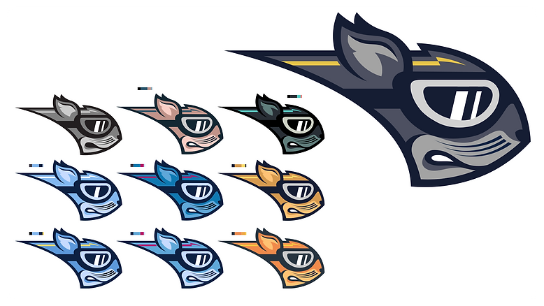
Primary Logo
Depicts our flying squirrel mascot in aviator flight goggles. Complete with electric gold stripe for movement.

Script Wordmark
A script logo allows for a less serious mark to be used for contrast and plays into the coastal feel.

Wordmarks
Bold, blocky fonts emulate markings and designations used on aircraft and naval ships.
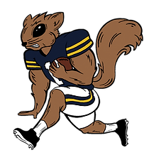
Fauxback "Flying Larry"
College football is known for cartoonish vintage logos - we wanted to include our own showcasing our flying squirrel as if hurdling a defender.
Primary Uniforms
The primary consideration when designing the main jersey wardrobe was creating combinations that could be worn interchangeably.
The Home, Away, and Battle Grey alternates follow the same overall template, using bold block numbers with single gold stroke, a large chest wordmark, and "wing" stripes extruding from the Vapor Fuse seam over the shoulder.
Each Helmet, Jersey, and Pant is interchangeable with each part of the other two sets, making for a wide variety of intentional uniform combinations.


USS North Carolina
"Showboat" Alternate

The USS North Carolina - A.K.A Showboat - is a WWII era naval battleship that is now permanently moored in Wilmington, NC. We wanted to pay tribute to the ship and tie in the Flyers naval connections by creating a purpose-designed alternate uniform based on "Showboat" itself.
The colors are inspired by the North Carolina's blue-grey, navy, and white livery, and the numbers and wordmark again emulate battleship markings.
The helmet features a riveted metal texture with the North Carolina symbol from the state flag on one side, and the player number on the other. The shoulders feature an American flag patch.
"Fear" Alternate

The "Cape Fear" name provided the perfect opportunity to create a blackout uniform.
We wanted to convey speed with this set, transforming the electric gold lightning bold shape from the primary logo into the standout helmet stripe / logo.
We also used a different variation of the wing style stripe, this time placed on the sleeve rather than the shoulder, strengthening our aviation theme.

Design Process
Sketches

Vectorization & Color Palette
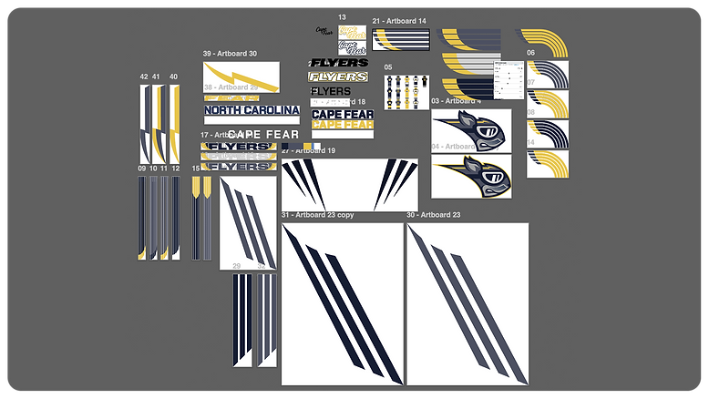
Uniform Elements & Misc.